Brand Identity
Click on any image to enlarge
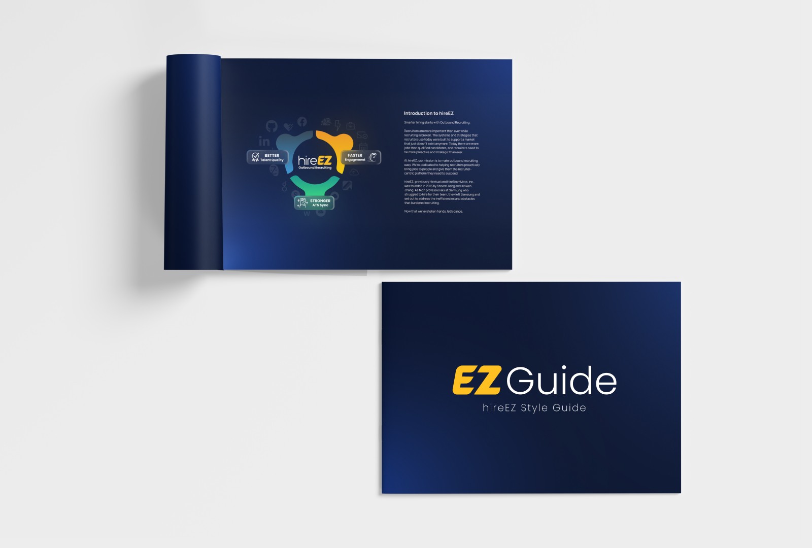
HireEZ — Brand Guide
HireEZ is a software company focusing on outbound talent acquisition services for recruiters. The company went through a major brand revival in 2021 going from Hiretual to HireEZ. One of the biggest reasons for the change was plainly how difficult it was to pronounce Hiretual. Since making this transformation the marketing team did not have a style guide for their new appearance.
Approach
The brand guide included a set of 38 pages, detailing how the brand was to be positioned, how marketing was using the brand, communication lines with marketing, and resources available to the team. Lapis Blue being an excellent color to offer contrast to HireEZ's logo, and allowing the ivory copy to speak with no struggle.
If you'd like to view a more detailed look of the book, your wish is granted.


Curana Health — Spring Campaign
Curana Health is a senior living entity that focuses on insurance benefit offerings and facility options for its members. Curana Health manages a portfolio of ten brands that each have their own region reach in their respective states. The idea of senior living can sometimes be seen in a cynical light, as people are leaving the familiar comfort of their homes and coming to a place they most likely will be for the remainder of their life. Our mission is to soothe their fears and embrace them with warm open arms. Marketing's task is to simply communicate this mission and to whisper, "you're our guest, and we will do our best."
Approach
Rooted in Coordinated Care was 2024's Spring Campaign with a focus on the season of beginnings. We want you to know there are activities to keep you active, there are warming smiles, providers are more than faithful stewards they are rooted in care. If you look carefully you can see topographic vines behind the portraits for subtle depth. The headline "Rooted in Care" has connection between the A and R to convey the bond between care provider and member. Forest greens and sandy tans used for the palette to really feel that connection to the earth. Leaf icons to break the mundane of common bullet points. We're not common, we're care givers.

Curana Health — Event Flyers (TV Ads)
At Curana Health Senior Living we want members to know the future isn't ending, we'll light that spark daily, weekly, monthly. We want every day to feel radiant. Marketing creates endless flyers for its communities to know what recent events are coming soon. My role as a brand designer was to make sure these announcements not only communicated, but invited.
Approach
In the beginning of my time at Curana many of the event flyers were vertically printed in usual industry standard. We found there to be issues with these going to 33 states, with multiple contact information and dates. An easy remedy to this was Powerpoint slides that could be landscape printed. This would allow agents to be able to manually enter their information and print at their local communities. Showcased in the image are a few examples of annual events.
I didn't want to overwhelm your viewing experience by posting a myriad of slides, but if you'd enjoy seeing these more closely I can grant your wish with pleasure

TPAC — Shareholder Letter
TPAC, the Tennessee Performing Art Center is a landmark theater located in downtown Nashville. During the summer of 2021 I was contracted as an independent contractor to assist in their shareholder appreciation campaign.
Approach
The primary purpose of this letter was to communicate gratitude to their shareholders. "Thank You" was added to the letter and envelope in a 15% opacity to give subtle depth. Around the border of both pieces I wanted to bleed the backside to the front to break up the white space and offer a pop of color. On the back was a list of their shareholders blended with TPAC brand colors, a firecracker gradient.